Dashboard Showcase
7 Pages. One Complete Picture.
Each dashboard page answers a specific business question, from executive revenue oversight to safety compliance designed to serve different organizational stakeholders.
1
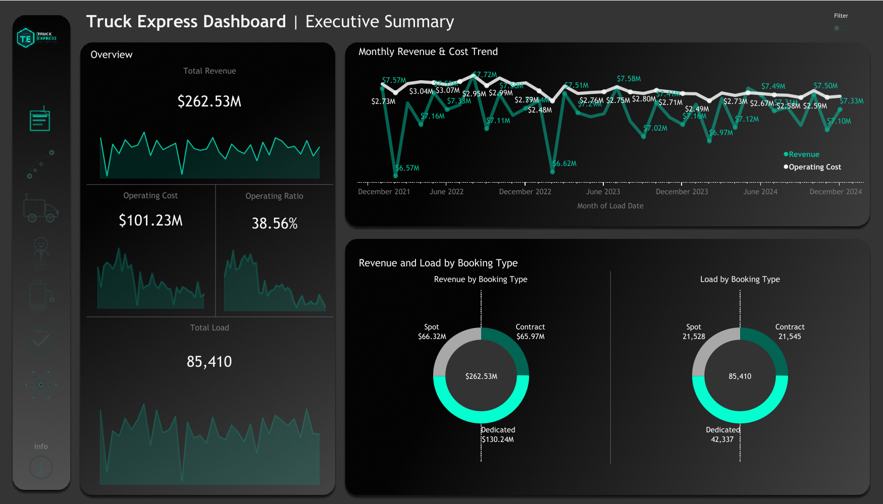
Executive Summary
Revenue, cost, and operational health at a glance
Key KPIs
Visualizations
- Dual-line chart showing monthly Revenue vs Operating Cost from Dec 2021 to Dec 2024 — reveals consistent cost discipline with revenue staying well above cost throughout the period
- Two donut charts breaking down total loads and revenue by booking type: Contract, Spot, and Dedicated — Dedicated loads represent 49.6% of revenue at $130.24M
- Sparkline KPI cards with mini trend lines for at-a-glance directional context
Key Insights
- Operating ratio of 38.56% is exceptionally healthy — industry benchmark is below 95%, meaning the company spends just $0.39 for every $1.00 earned
- Dedicated contract loads dominate revenue ($130.24M) but spot loads (21,528) and contract loads (21,545) are near-equally split by volume, suggesting pricing power on spot remains strong
- Revenue shows no sustained decline over 3 years, a sign of stable demand and consistent customer relationships
2
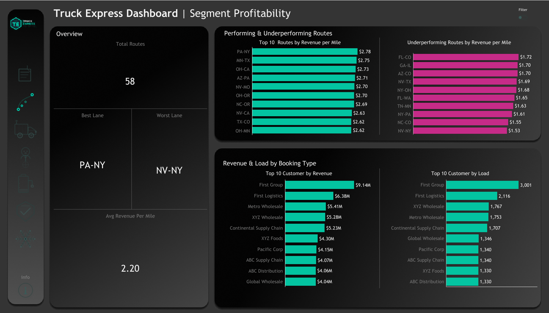
Segment Profitability
Route performance and customer revenue analysis
Key KPIs
Visualizations
- Side-by-side horizontal bar charts showing Top 10 Performing Routes and Top 10 Underperforming Routes by revenue per mile
- Top 10 Customers by Revenue and Top 10 Customers by Load Count — two separate rankings revealing that high-frequency shippers are not always the highest-revenue accounts
Key Insights
- PA-NY leads all lanes at $2.78/mile — 26% above the fleet average of $2.20/mile — a lane worth protecting and potentially expanding capacity on
- NV-NY sits at the bottom at $1.53/mile — 30% below average — a strong candidate for rate renegotiation or load optimization
- First Group leads customers by revenue at $9.14M and load count at 2,116 — suggesting First groups ships more frequently at high per-load rates
3
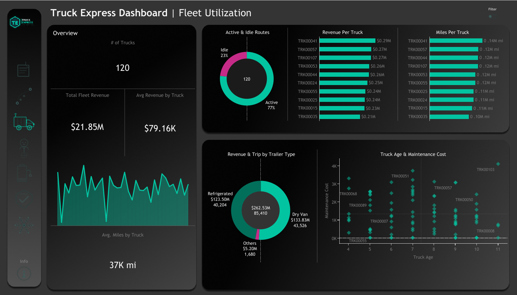
Fleet Utilization
Asset performance, idle analysis, and trailer breakdown
Key KPIs
Visualizations
- Active vs Idle donut — 77% active, 23% idle — 28 trucks generating zero revenue at any given time
- Revenue Per Truck and Miles Per Truck bar charts — identifies top and bottom performing assets
- Revenue & Trip by Trailer Type donut — Dry Van leads at $133.83M across 43,526 trips; Refrigerated at $123.50M across 40,204 trips
- Truck Age vs Maintenance Cost scatter — older trucks cluster at higher maintenance cost, quantifying the aging fleet risk
Key Insights
- 23% idle rate means roughly 28 trucks are not generating revenue — at the fleet average of $79.16K per truck, recovering even half of that idle capacity adds ~$1.1M annually
- Dry Van and Refrigerated trailers handle nearly 99% of trip volume — the "Others" category ($5.20M, 1,680 trips) may represent specialty underutilized assets
- Truck age shows a clear positive correlation with maintenance cost — a data-backed case for fleet renewal planning
4
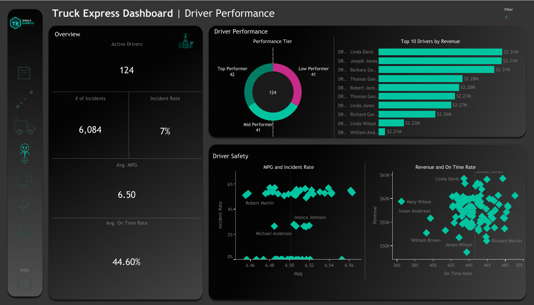
Driver Performance
Revenue, safety, MPG, and on-time rate per driver
Key KPIs
Visualizations
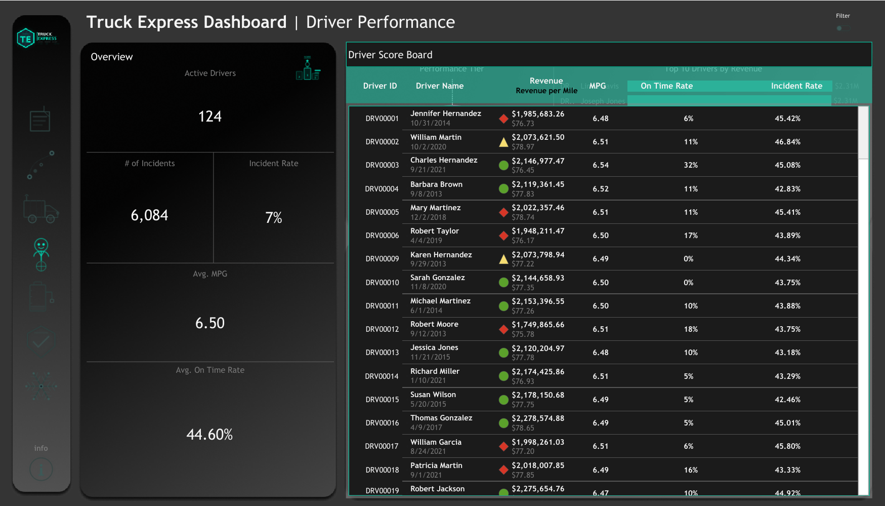
- Performance Tier donut: 124 drivers segmented into Top Performer (42), Mid Performer (41), and Low Performer (41) tiers — near-even distribution across tiers
- Top 10 Drivers by Revenue — horizontal bar showing the top revenue contributors, led by Linda Davis at ~$2.31M each
- MPG vs Incident Rate scatter plot — all 124 drivers plotted, revealing whether fuel-efficient drivers correlate with safer driving behavior
- Revenue vs On-Time Rate scatter — surfaces whether high-revenue drivers are also reliable on delivery schedules
Key Insights
- Top performers (42 drivers) are generating disproportionate revenue — investing in this cohort through incentives and preferred route allocation would maximize fleet ROI
- 44.60% average on-time rate is critically low — industry standard is 95%+ — signaling systemic issues with scheduling, routing, or driver planning
- The Driver Score Board (separate sheet) provides full individual-level drill-down across revenue, MPG, on-time rate, hire date, and incident rate for all 124 drivers
5
Fuel & Maintenance
Cost control, efficiency trends, and downtime analysis
Key KPIs
Visualizations
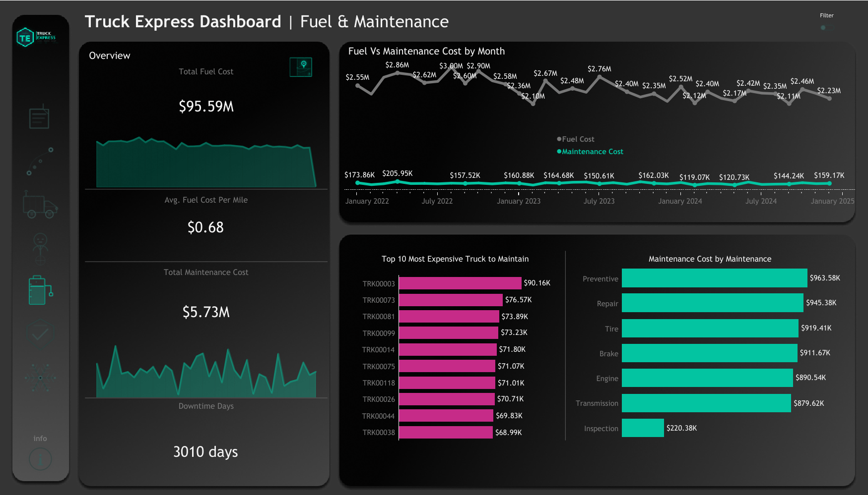
- Fuel vs Maintenance Cost by Month dual-line chart — both cost lines show volatility, with fuel peaking at $2.90M in individual months
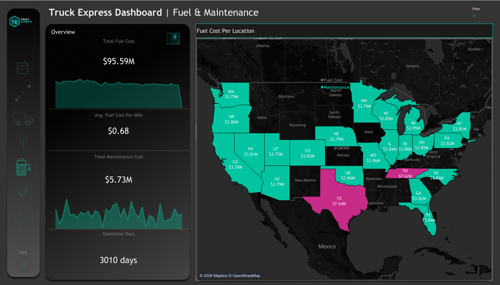
- US state-level filled map showing Fuel Cost per Location — Texas ($7.64M) and Tennessee ($7.62M) are the highest-cost fuel states
- Top 10 Most Expensive Trucks to Maintain — TRK00003 leads at $90.16K total maintenance spend
- Maintenance Cost by Type bar chart — Preventive ($963K), Repair ($945K), Tire ($919K), Brake ($912K), Engine ($891K), Transmission ($880K) — a remarkably even distribution
Key Insights
- Fuel at $95.59M represents 94.3% of total operating costs — making fuel efficiency the single highest-leverage cost reduction target in the entire business
- Texas and Tennessee fuel spend likely correlate with high trip density through those states — route optimization through cheaper-fuel corridors could yield meaningful savings
- 3,010 downtime days over 3 years equates to roughly 8.2 truck-years of lost capacity — a quantifiable cost of deferred maintenance decisions
6
Safety Metrics
Incident analysis, compliance, and risk by route and driver
Key KPIs
Visualizations
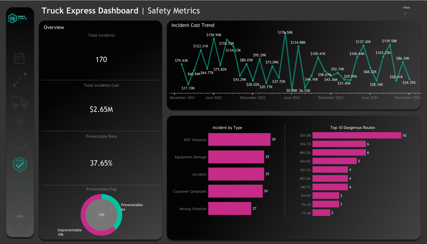
- Incident Cost Trend line chart — monthly incident costs are highly volatile, spiking to $176.5K in one month — identifying high-risk periods for targeted intervention
- Incident by Type bar — DOT Violations (39) and Equipment Damage (35) lead, followed by Accidents (35) and Customer Complaints (34)
- Top 10 Dangerous Routes — OH-OR leads with 10 incidents; WA-TX and MN-GA at 6 each — geographic safety hotspots that demand operational review
- Preventable Flag donut — 64 preventable vs 106 unpreventable — 37.65% of incidents were avoidable with better training or protocols
Key Insights
- DOT Violations (39) are the most frequent incident type — a direct regulatory and insurance risk that targeted compliance training could address immediately
- $2.65M in incident costs over 3 years averages $883K/year — preventable incidents at 37.65% represent ~$332K/year in avoidable cost
- OH-OR route with 10 incidents warrants an immediate operational audit — whether it's the terrain, schedule pressure, or specific drivers on that lane
7
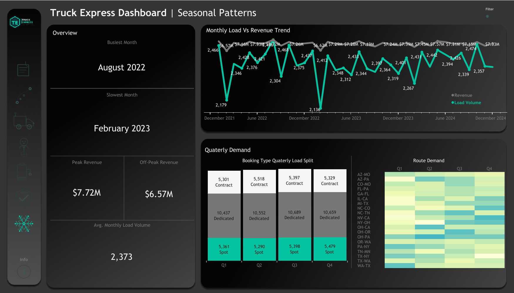
Seasonal Patterns
Demand trends, quarterly splits, and route seasonality
Key KPIs
Visualizations
- Monthly Load Volume vs Revenue dual-axis line chart — 3-year view showing the relationship between volume fluctuations and revenue response
- Booking Type Quarterly Load Split table — Contract, Dedicated, and Spot loads are remarkably stable across all four quarters, suggesting demand is relatively non-seasonal
- Route Demand Heatmap by quarter — color-encoded table showing which lanes experience highest demand in which quarters
Key Insights
- Demand is more stable than seasonal — the $1.15M gap between peak and off-peak revenue is relatively modest for a $262M/year operation, suggesting strong contract-based demand smoothing
- Booking type splits are near-identical across all four quarters — Dedicated loads maintain ~10,500 per quarter regardless of season — a highly predictable revenue base
- February consistently underperforms — capacity and cost management during this window (reduced headcount, deferred non-critical maintenance) could improve off-peak margin